Wardrobes · 16 min read · 2 August 2026
Wardrobe colour combinations for bedrooms: light, floor and handles
How to choose wardrobe colours for a bedroom: start from room light, floor and walls, then small against large rooms, two-tone doors, wood-look with white, grey and bronze with glass, warm and cool whites, handles, and how to test a door sample through the day.

By Ali Haider Basra, Founder, Al Tareeq Decor · Contact our workshop
Key takeaways
- Choose by the room first: its light, its floor and its walls. Dim rooms suit light, warm colours; a dark wardrobe in a poorly lit room can read as a cave.
- In a small room, keep the doors light and close to the wall colour. A large room can carry two tones or one deeper colour.
- Two-tone works best with one idea: a light body with a dark frame, or one accent door, not both.
- Every white leans warm or cool, and glass and mirror doors bring the room's colours into the wardrobe, and glass doors and privacy compares clear, tinted, frosted and reeded options. Match the lean of the wardrobe to the walls and lamps.
- Test a door sample in your room by day, at dusk and under your lamps. Our free measuring visit brings finish samples.
On this page
- Key takeaways
- Wardrobe colour combinations: the short answer
- Which colour direction for which room
- Start with the light in the room
- Floor and wall colour: the wardrobe is one of three big surfaces
- Small rooms and large rooms
- Two-tone doors: light body, dark frame, or one accent door
- Wood-look with white
- Grey and bronze, with mirror or tinted glass
- Warm whites and cool whites
- Handles and the inside of the wardrobe
- Light changes through the day, and how to test with samples
- A colour test for a door sample, step by step
- What we do about colour
- Common questions
Wardrobe colour combinations: the short answer
Choose the wardrobe colour last in your head but first on paper: it is the largest single surface in most bedrooms, so it sets the room, and it is the one colour you cannot repaint next year. Three questions settle most choices. How much light does the room get, and from which side? What colour are the floor and the walls that the wardrobe will stand against? And is the room small enough that a dark wall of doors will close it in?
Colour theory from the sources we opened gives a short starting kit. Light rooms take almost anything; dim rooms do better with light, warm colours; a dark wardrobe in a poorly lit room can read as a cave; and a white is never just white, because every white leans warm or cool. Beyond that, a decorating guideline, 60-30-10, is useful as a check that the wardrobe is not the only strong colour in the room. None of this is a UAE rule; we found no source for what is fashionable here and we do not claim one.
This page is about colour only. What the finishes are made of is in our wardrobe door finishes guide, matt against gloss is in matt vs gloss wardrobe doors, and the plan of the whole room is in our master bedroom wardrobe design guide.
Which colour direction for which room
Dim room, small window or facing away from the sun
- Direction to try
- Light body, warm white or soft neutral, a little wood-look
- Why
- Sherwin-Williams: north-facing rooms get the least light; PaintDB: a deep wall in a poorly lit room reads as a cave
Bright room, lots of daylight
- Direction to try
- Almost anything; deeper colours work
- Why
- Strong light carries a dark wardrobe; the risk becomes a very warm colour looking too bold (Sherwin-Williams, for south light)
Small bedroom
- Direction to try
- Light, one main colour, doors close to the wall colour
- Why
- PaintDB: high-reflectance colours make a small room feel larger (our reading for a wardrobe wall)
Large bedroom
- Direction to try
- Two tones or one deeper door colour
- Why
- More wall to balance it; the colour can carry the room (our reading)
Used mostly in the evening
- Direction to try
- Test it under your lamps first
- Why
- Whites shift between morning and evening (Benjamin Moore); artificial light is part of the test
Mirror or tinted glass doors
- Direction to try
- Neutral or grey surroundings
- Why
- The doors show the room, so its colours become part of the wardrobe (our reading)
Colour guidance is from the paint and decorating sources named under the article, which are about paint and rooms in general, not wardrobes in the UAE. The sample in your own room has the last word.
Start with the light in the room
Sherwin-Williams, a paint maker, organises its colour advice by which way a room faces, and the same logic applies to a wardrobe wall. North-facing rooms receive the least light through the day, and it advises avoiding cool undertones there because they make the room feel colder. South-facing rooms have consistent warm light, where very warm colours can start to look too bold at some hours. East-facing rooms have warm light in the morning and cooler light toward evening, and west-facing rooms are the reverse.
The practical part is its last point: choose by when you use the room. A bedroom people use mostly at night is judged under lamps, not the sun, so the colour that looks right at noon may not be the one you live with. This is also the honest limit of any article on colour: your windows, your curtains and your light bulbs are not in our reference pages. How curtains change the light a wardrobe wall receives is a subject in itself; our curtain colour guide covers the window side.
A wardrobe wall is rarely the lit wall, either. It is often a long, shaded wall with the window on the side, so judge the colour in the place the doors will hang, at the angle you see them from the bed and from the doorway.
Floor and wall colour: the wardrobe is one of three big surfaces
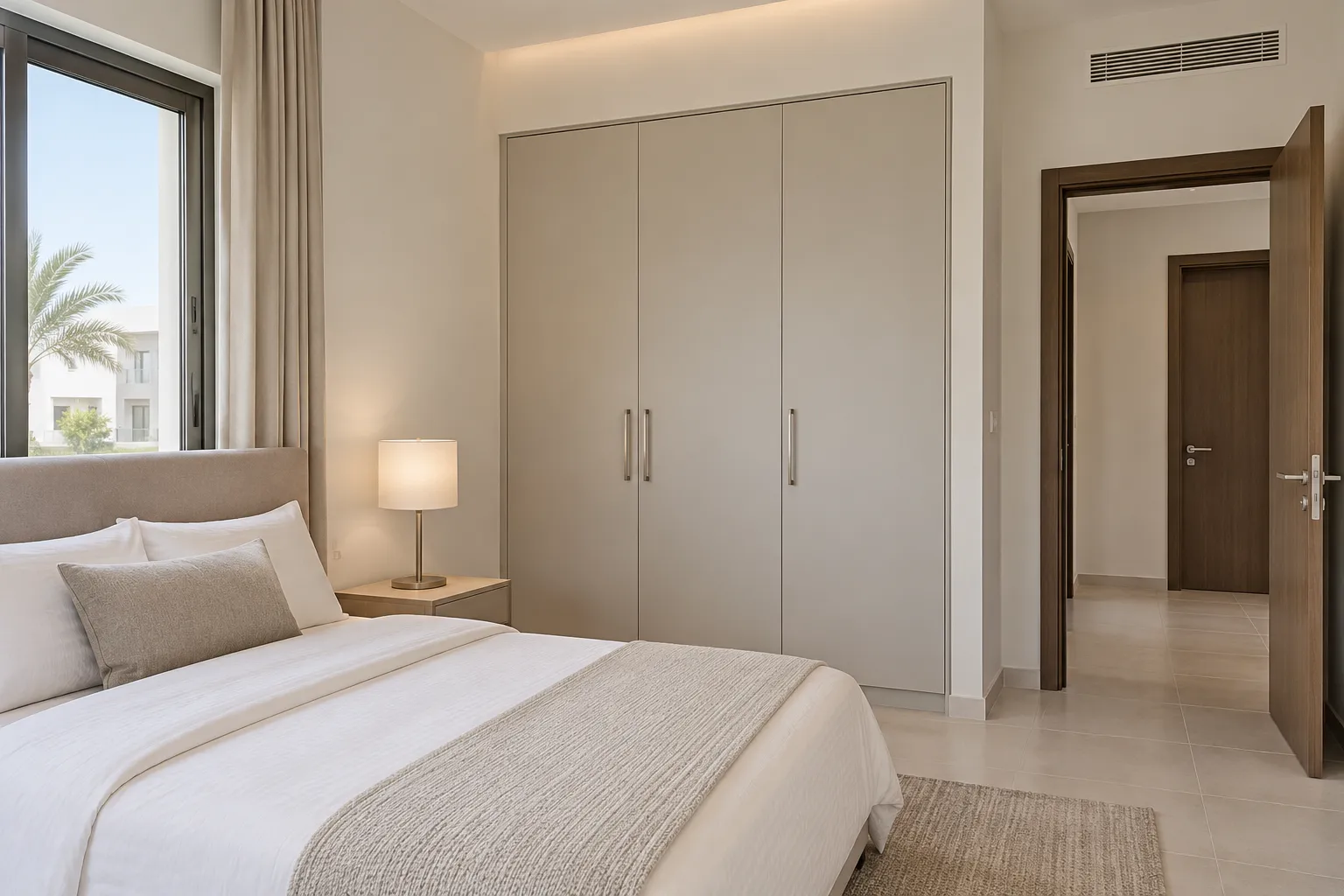
A bedroom usually has three large surfaces: the floor, the walls and the wardrobe wall. The 60-30-10 guideline, as Living Etc explains it, splits a scheme into 60 percent of one colour, 30 percent of a second and 10 percent of a third in small touches. It is a rule of thumb and not a law, but it is a handy check. If the walls and ceiling are pale, the wardrobe is the second colour, and handles, mirror frames and lamps are the touches. A wardrobe that is the same pale colour as the wall almost disappears, which can be the point in a small room; a wardrobe darker than the walls becomes the room's main feature.
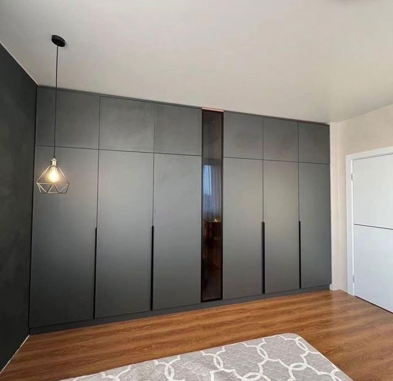
Floor colour matters because doors run down to it. A light grey or pale tile floor takes both light and dark doors; a warm wood-tone floor next to cold grey doors can look as if the two are in different rooms. Hold the sample against the floor and the wall at the same time, rather than seeing it alone on a table. The dark wardrobe photograph below shows one way it can work: charcoal doors with a charcoal wall at one end and a warm wood floor, with the handleless fronts keeping the colour continuous. For what a handleless front means in daily use, see our guide to handleless wardrobes against handles.
If the wall colour will change later, say so at the start. A rented flat, in particular, often gets repainted by the landlord, and a strongly coloured wardrobe stays. Our rented apartment wardrobe guide is the place for what to ask before you commit to a colour that you cannot take with you.
Small rooms and large rooms
PaintDB, an information site on paint, explains LRV, the light reflectance value, as a scale from 0 for pure black to 100 for pure white that tells how much visible light a colour bounces back, and notes that real whites top out at about 90 to 94. Its point for rooms is direct: colours with a high value make a small room feel larger and a dim room less dim, while a deep colour in a poorly lit room reads as a cave and needs more layered light. A paint article says nothing about laminate or lacquer doors, so take it as the idea, not a measurement of any wardrobe finish; we do not quote LRV numbers for ours.
For a small bedroom, that points toward light doors that sit close to the wall colour, so the wardrobe reads as part of the wall. A small bedroom wardrobe works with depth and door type first and colour second, and a studio apartment wardrobe has the same logic in a room that does everything. A floor-to-ceiling wardrobe makes a pale colour almost essential in a small room, because the wardrobe fills the whole wall.
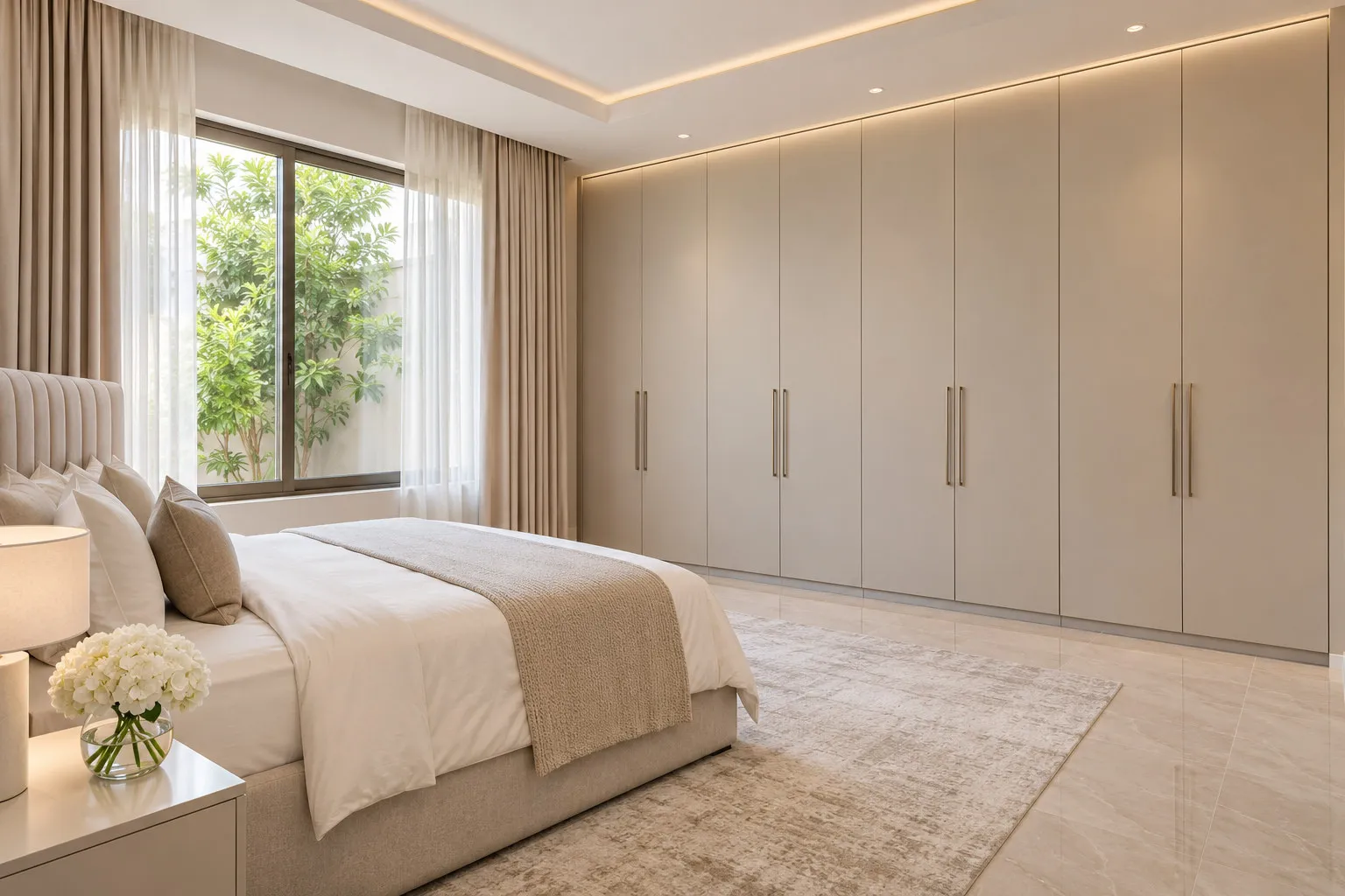
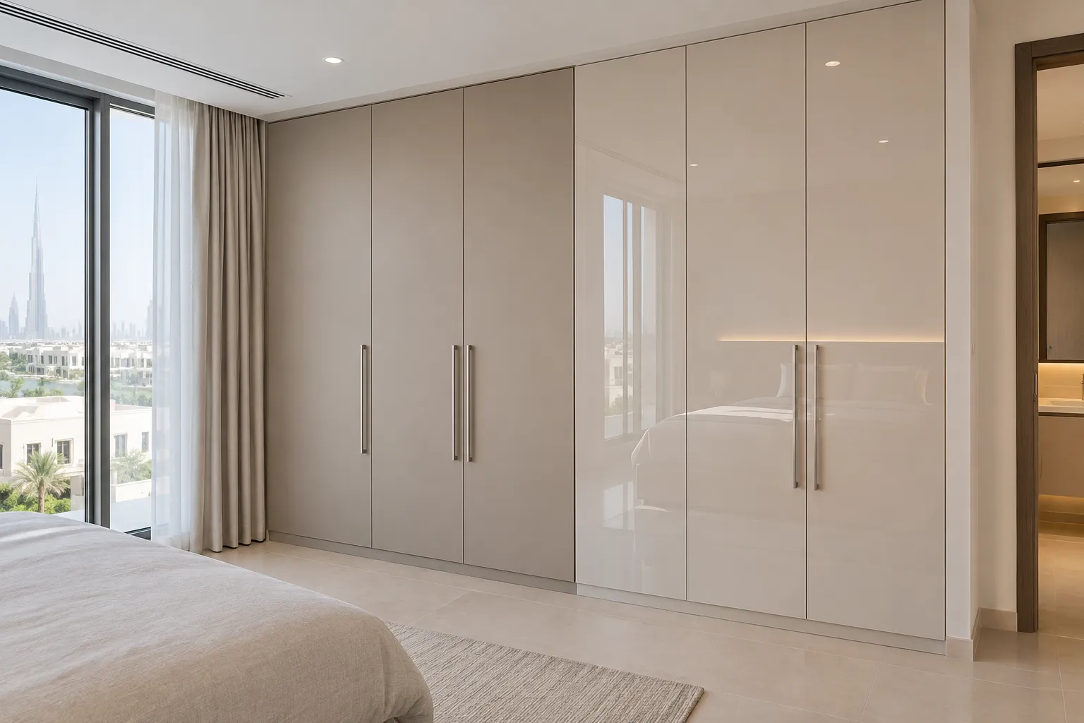
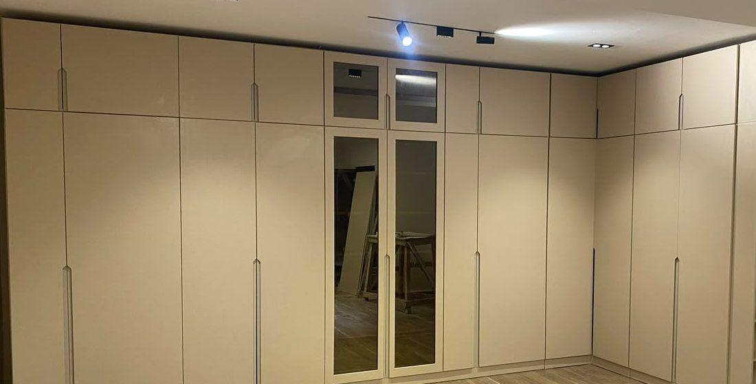
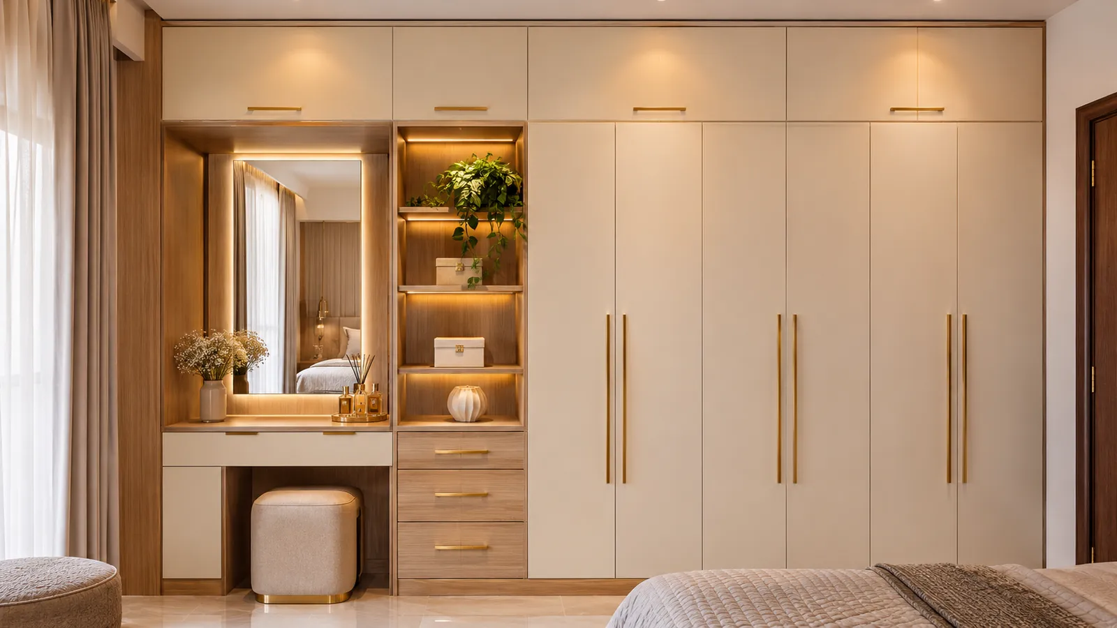
A large room can carry a deeper colour or two tones. The risk is different: a long run of one dark colour can feel heavy and flat. Breaking the run with a second tone, a glass section or a mirror door gives the eye something to stop on. The beige wall of doors below is a light example: one soft colour across the whole wall, with two framed mirror and glass doors, a few lighter breaks in a long run.
Two-tone doors: light body, dark frame, or one accent door
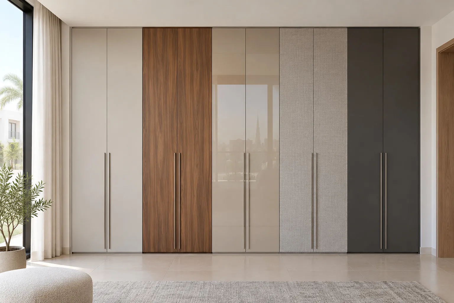
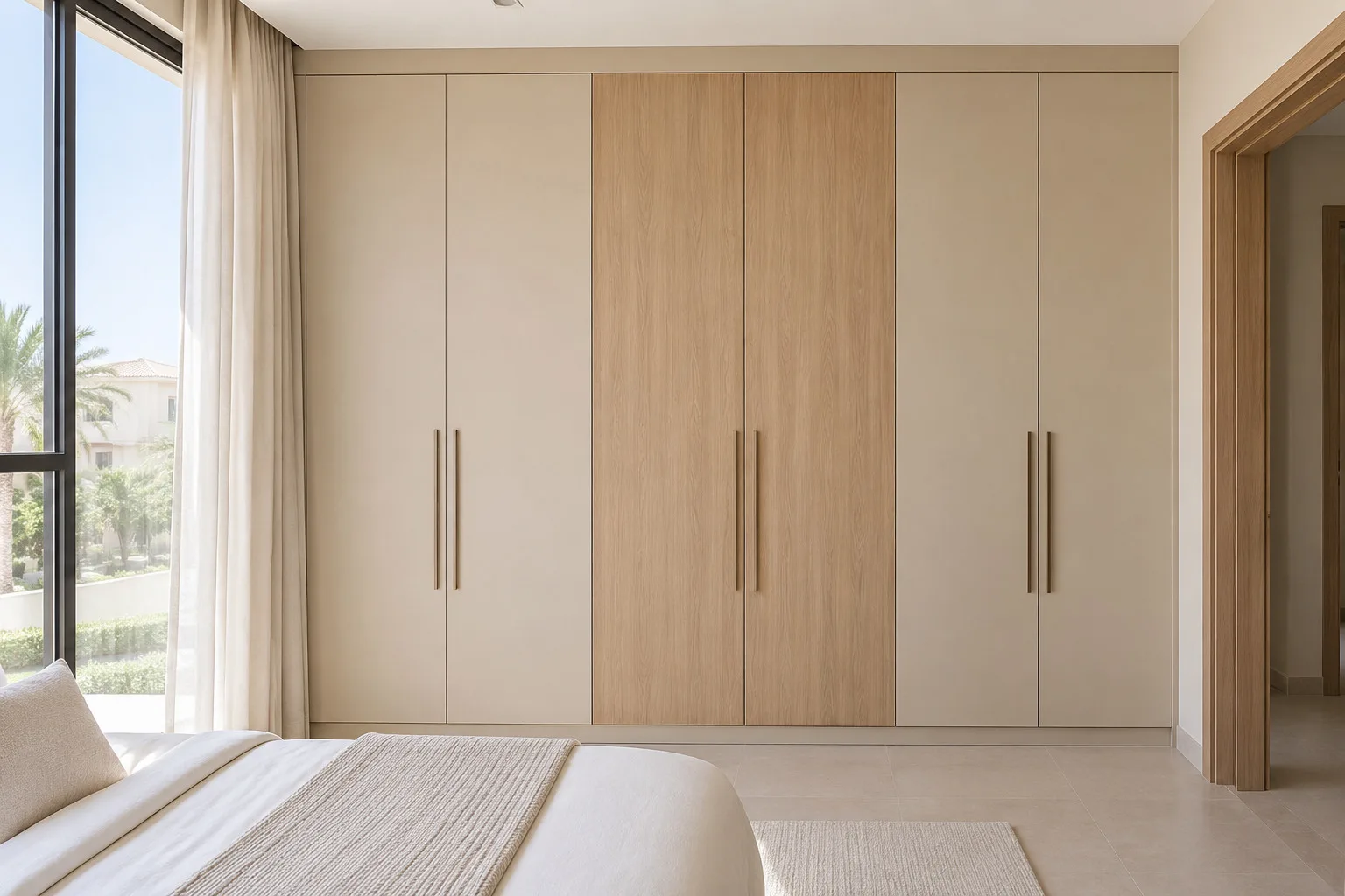
Two tones are the answer when one colour is too plain and three are too many. There are two simple ways to do it. In the first, the body and doors are light and the frames or edges are dark: a pale door in a dark frame reads like a picture on the wall and is the easiest way to add contrast without a dark mass. In the second, the whole wardrobe is one calm colour except for one accent door or bay in a second colour, such as a wood-look door in the middle of a run of white.
Our rule of thumb, which is ours and not a source's, is to keep the accent small: if the 60-30-10 guideline is right that the third colour belongs in small touches, an accent door in a long run of doors is already a large touch, and one is enough. Keep the second tone to one repeat: a second wood-look door at the far end, not in the middle of every bay, keeps the run readable.
In practice two-tone doors are ordered as separate door colours or finishes on one drawing, so the quotation has to list each colour and where it goes. The drawing, not a sample alone, is where an accent door is placed, and our wardrobe quotation checklist has the lines worth asking for. If your hinged run has a corner, remember that doors on both arms are seen together; see corner and L-shaped wardrobe design.
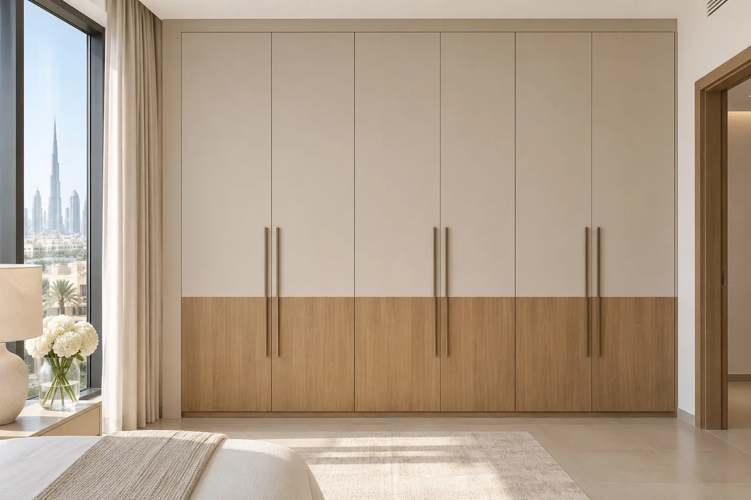
The drawing below runs through four pairs on one wardrobe elevation: a light body with one wood-look door, a light body with a dark frame, grey with bronze tinted glass and charcoal with pale handles. The colours are drawn as examples to show how pairing works; they are not a product range or a list of what we stock.
- 1. Light body with one wood-look accent door and brass-tone handles
- 2. Light body and doors in a dark frame, dark handles to match
- 3. Grey body with bronze-framed tinted glass doors and bronze-tone handles
- 4. Charcoal body and doors with pale handles so the pulls still show
- 5. The check: a sample held in your own room, by day, at dusk and under your lamps
Wood-look with white
White and a warm wood-look is the pairing most people picture first, and it works for a plain reason: white is the quiet colour and wood is the warm one, so each makes the other look intentional. A wood-look finish is one of the finishes we make, and laminate is the entry finish in our specification, so it is the easiest way to bring wood tone into a wardrobe without the cost of real timber. For what real veneer does differently, including how timber ages in sunlight, our door finishes guide has it.
Two cautions are our reading, not a source's. First, a wood-look door looks different next to white than alone on a sample board, because the white changes how warm it appears, so hold the two together. Second, the wood-look should match something else in the room, the floor or the furniture, or it can look like an accident. If the floor is a cool grey, a very orange wood-look is likely to clash; a pale, neutral wood-look is the safe choice.
A fluted or slatted door adds texture rather than colour but changes how the colour reads, because the grooves cast shadows; see our fluted wardrobe doors guide if the pairing you have in mind is wood and white.
Grey and bronze, with mirror or tinted glass
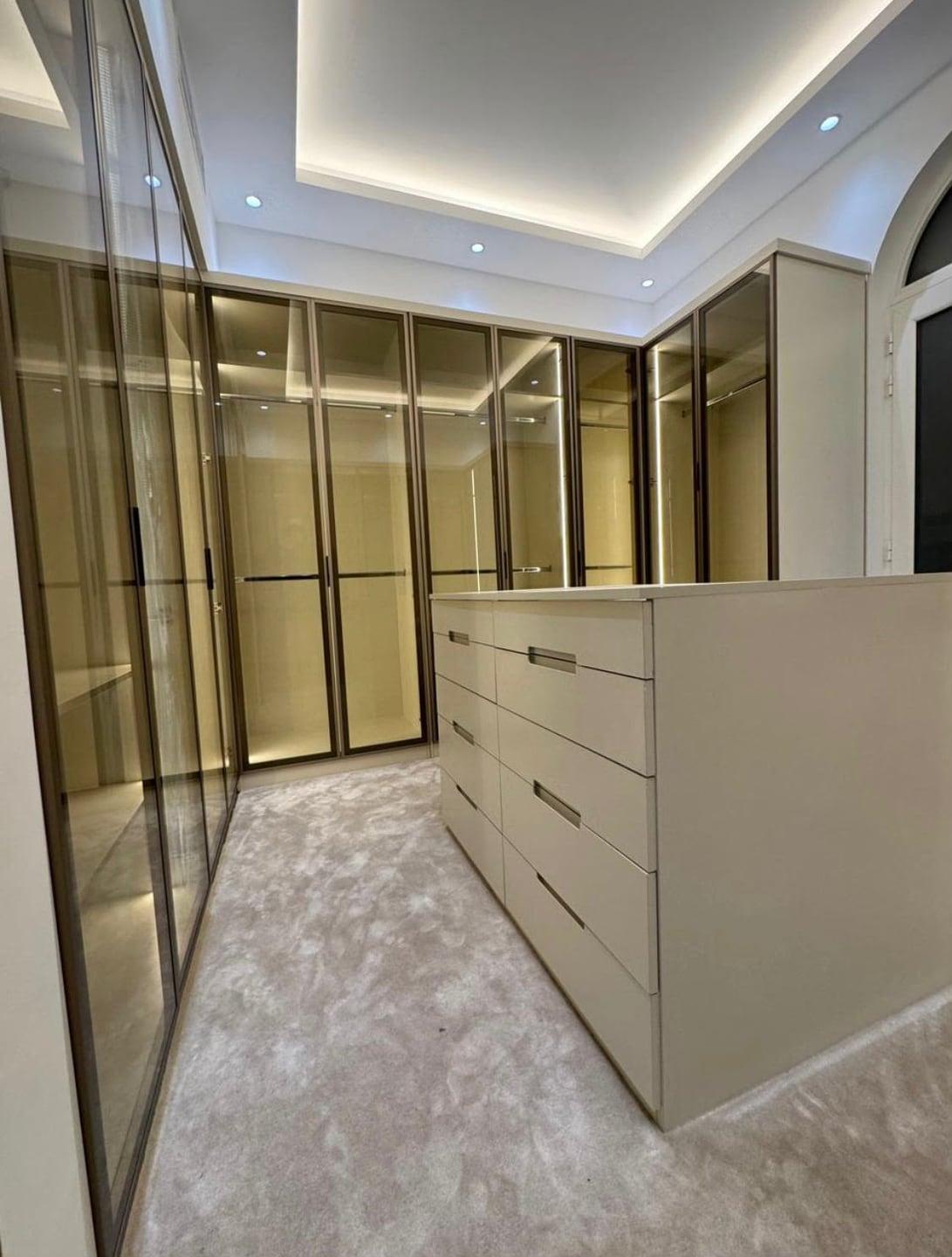
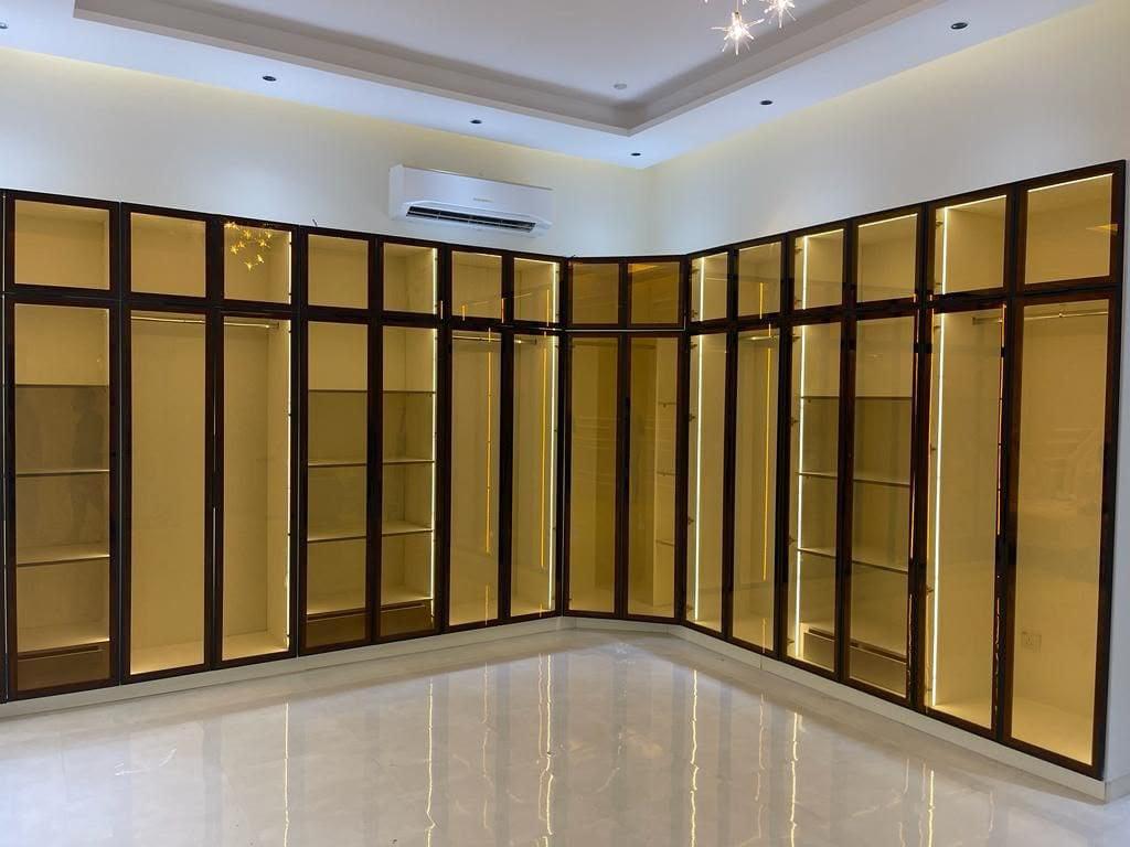
Grey is the neutral that behaves best next to metal. Grey doors beside bronze-tinted glass or a bronze frame give a calm, slightly warm pairing, and both are finishes we publish: aluminium frames with grey or bronze tinted tempered glass. Our bronze-framed corner wardrobe below shows the effect with light inside, where the glass takes on a warm tone from the strip lights.
Glass and mirror change the arithmetic, because they show whatever is in front of them. A tinted-glass door shows the contents of the wardrobe as a dim, coloured shape; a mirror shows the room. That means the colours of the opposite wall, the bed and the floor all become part of the wardrobe's colour. In a room with strong colours a mirror door can double them, so keep the room calm or confine the mirror to one or two leaves. Our mirror wardrobe doors guide has the weight and safety side.
If you want light inside the glass, the colour of the light is a colour choice too: a warm strip makes the contents look warm and a cool one makes them look cool. See wardrobe LED strip or profile for the options, and our lit glass-front wardrobes page for the finished look.
Warm whites and cool whites
Benjamin Moore describes white as a colour that is especially prone to taking on different tonalities from morning to evening under natural and artificial light. It also says warm whites have red, orange and yellow undertones, and cool, crisp whites have green, blue and violet. A wardrobe in a warm white next to walls in a cool white will look yellow, and the other way round it will look grey; the two do not have to be identical, but they should agree.
Our own way to see the lean is to hold each sample against a plain sheet of white paper. Then decide by the rest of the room. Warm whites go with wood-look, brass-tone handles and warm lamps; cool whites go with grey, black handles and daylight bulbs. Sherwin-Williams' advice for dim north light, to prefer warm undertones, is a reason to lean warm in a room with little sun; in a room full of strong warm light, a cooler white can look cleaner.
Gloss and matt change how white looks as well, since gloss shows reflections of the room. That is the subject of our matt vs gloss guide; here the point is only that the sample must be the finish you will order, not a similar one.
Handles and the inside of the wardrobe
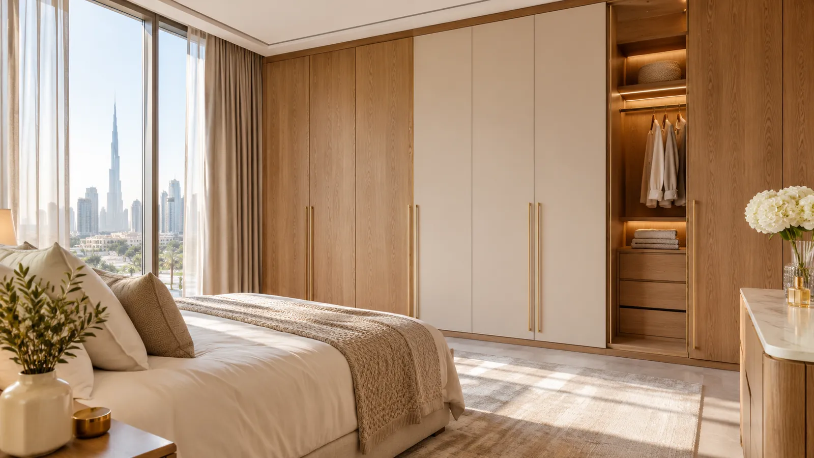
Handles are the 10 percent. A handle that matches the door almost vanishes; one that contrasts becomes a pattern of dots down the wall. Dark doors with dark handles keep a quiet line; light doors with dark handles make the handles the drawing. Brass-tone handles on white warm the wall, black handles on white sharpen it, and on dark doors a pale handle is the one that can still be seen. The types, heights and care of each finish are in our wardrobe handles guide; a front with no handle at all takes the question away.
The inside matters because glass and open sections show it. A glass-front or open wardrobe is seen from the room, so its interior colour is part of the colour scheme, and a pale interior makes a dark wardrobe feel lighter when the doors open. Interior colour also changes how bright the inside is before any lighting is added; the wardrobe lighting ideas guide and the interior lighting ideas cover what light does for each colour. A dark interior is a harder place to find a pair of socks, which is a practical reason to keep it pale.
If the wardrobe is a wall of open shelves rather than doors, colour becomes whatever you put on the shelves; our open or closed wardrobe guide is the place for that decision.
Light changes through the day, and how to test with samples
Sherwin-Williams suggests testing paint chips before committing, and Benjamin Moore's advice for whites is to live with brush-on or peel-and-stick samples for a few days before you buy. Both are about paint, and a door sample is not a paint chip, but the method carries over: see it for several days, not for five minutes.
Our free measuring visit brings finish samples to the room. That is the useful moment for colour, because you are looking at the real doors in the real light, not at a screen. Use the list below; it is our own method, built from the sources above.
A colour test for a door sample, step by step
Hold the sample on the wardrobe wall, at door height
- What to look for
- The colour against the floor and wall together
- Why
- Surfaces change each other's tone (our method)
Look in the morning, at midday and in the evening
- What to look for
- Does it turn warmer, cooler or greyer?
- Why
- Whites change tone from morning to evening (Benjamin Moore); east and west rooms see the light shift (Sherwin-Williams)
Look under your own lamps at night
- What to look for
- The colour you will see most
- Why
- A bedroom is used at night; artificial light is a different light
Hold it next to the handle and the glass sample
- What to look for
- Whether the three belong together
- Why
- Handle, door and glass are one pairing
Tilt it
- What to look for
- Reflections and the change at an angle
- Why
- Gloss mirrors the room; see matt vs gloss
Leave it for a few days if you can
- What to look for
- Whether you still like it on day three
- Why
- Benjamin Moore: live with samples for a few days
A sample shows the colour of the sample. Colours on a phone or in a magazine are only a guide; the sample from the visit is the reference. Ask for the sample in the finish you will order.
What we do about colour
At the free measuring visit we bring finish samples to the room and measure the wall. Then we send a drawing and an itemised price, and nothing is made until you approve them. Colours and finishes are written on that drawing, so you can compare them with the samples before anything is cut. We have not published a colour range or named shades, so ask for the exact finish for each door in the quotation and we will write it down.
Our entry price is from AED 550 per sqm, installed, for MDF laminate with hinged doors; other finishes, such as lacquer, veneer or glass, raise it, and the figure for your wall is set after measurement. After you confirm, our Sharjah workshop builds the wardrobe and our own team installs it up to about 10 days later, depending on size and design, with a 24-month written workmanship warranty (supplied products follow their own terms). Separately, the wood-based boards carry a 5-year limited warranty, subject to terms; hinges, tracks, runners, rollers and other moving hardware are not covered.
Start with the free wardrobe measuring visit, then book through the consultation form. Our custom wardrobes service lists what we make, the built-in wardrobes page shows finished runs, and the sliding door wardrobes page shows another door type. For the price side read the wardrobe price guide and our pricing tool. The Sharjah page gives the workshop address. If you are only replacing doors, see wardrobe door replacement, and for a wardrobe that no longer suits the room, renovate or replace a wardrobe.
Colour comes late in the planning order; our wardrobe guide, step by step shows the decisions before it.
Common questions
What colour wardrobe is best for a small bedroom?
A light one, close to the wall colour. A paint information site, PaintDB, says high-reflectance colours make a small room feel larger and a deep colour in a poorly lit room reads as a cave. That is paint advice, not a wardrobe test; check a sample, and sprayed wardrobe doors explains how a door colour is recorded and matched. See our small bedroom wardrobe ideas.
What colour wardrobe goes with white walls?
Most do: a warm wood-look, grey, a soft neutral or a darker accent. The one to watch is the white itself, because it leans warm or cool, so hold the sample against the wall. Benjamin Moore describes warm whites with red, orange and yellow undertones, and cool whites with green, blue and violet. See our door finishes guide.
Does wood-look go with a white wardrobe?
Yes. That is our reading of how the colours behave, not a source's claim: white is quiet, wood is warm. Match the wood tone to the floor or furniture, and hold the two samples together. Wood-look is one of the finishes we make. See wardrobe door replacement.
Is a dark wardrobe too heavy for a bedroom?
Not if the room is bright or large enough, and the colour is carried by the wall or floor too. In a dim or small room it can feel heavy, and PaintDB's warning about deep walls in poorly lit rooms applies. A glass section or a pale handle breaks it up. See our fluted wardrobe doors guide.
Which handle colour for which door colour?
A handle that matches the door nearly disappears; a contrast makes it a visible pattern. On dark doors a pale handle still shows. Types and finishes are in our wardrobe handles guide, and no handle brand is part of our published offer.
How do I test a wardrobe colour before ordering?
Hold a door sample on the wardrobe wall, look at it in the morning, at midday, at dusk and under your lamps, and if possible leave it a few days. Our free measuring visit brings finish samples to the room. See the measuring visit guide.
Do colours change what a wardrobe costs?
The finish can: our entry price is AED 550 per sqm for MDF laminate with hinged doors, installed, and other finishes such as lacquer, veneer or glass raise it. We have not published a price per colour; ask in the quotation. See our wardrobe quotation checklist.

Sources & specifications
Manufacturer information applies to the named products and systems. Sources reviewed on 4 November 2026.
- Sherwin-Williams, Choosing Color Based on Room Orientation: north-facing rooms get the least light, avoid cool undertones there; south light warm and consistent; east warm morning and cool evening, west the reverse; choose by when you use the room; test with paint chipssherwin-williams.com(opens in a new tab)
- Benjamin Moore, white paint colors: whites take on different tonalities from morning to evening; live with samples for a few days; warm whites have red, orange and yellow undertones, cool whites green, blue and violetbenjaminmoore.com(opens in a new tab)
- PaintDB, What is LRV in paint: a 0 to 100 reflectance scale; real whites reach about 90 to 94; high values make small rooms feel larger; a deep wall in a poorly lit room reads as a cave (a paint-information site, not a manufacturer)paintdb.com(opens in a new tab)
- Living Etc, the 60-30-10 rule: 60 percent one colour, 30 percent a second, 10 percent a third in small touches; a rule of thumblivingetc.com(opens in a new tab)
Want this planned for your home?
Consultation and measurement are free. Tell us the rooms, location and what you need; we arrange a sample visit and define the measured quotation.